📌 Version 1.0 This is the first generation of our components. Some may have minor alignment differences or use widgets that aren't perfectly matched to the content type. Even so, they provide a strong structural foundation and are very useful for quickly building any type of website. We're continuously improving them; future versions will be even more polished.
Why does this look plain/unstyled? Snapelement components are intentionally unstyled. They contain no hardcoded colors, fonts, or spacing. When you paste them into Elementor, they automatically adopt your site's Global Styles (colors, fonts, buttons). The preview may look off or basic here, but once imported, every element matches your brand.
Layout
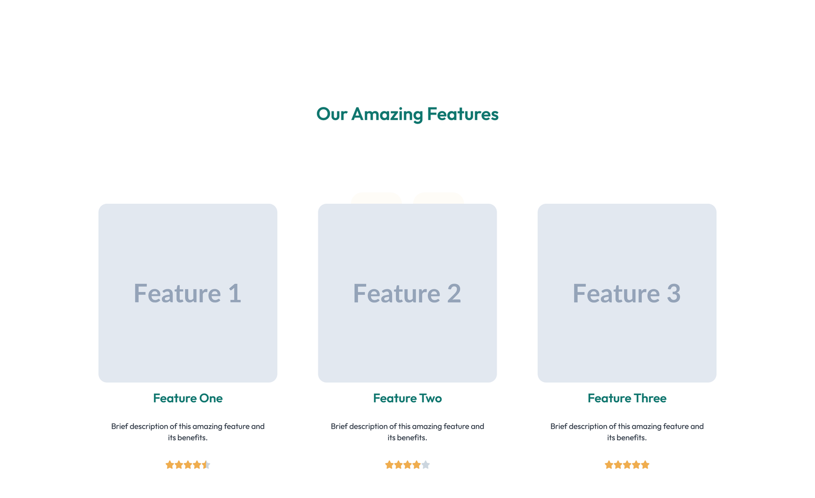
3-column icon + title + text cards
About This Component
Feature grids communicate the breadth and depth of a product or service through structured, visually appealing layouts. This feature section component from Snapelement delivers a professionally designed layout ready for any WordPress site using Elementor. The design features a well-organized layout with section heading and subtitle and single feature spotlight (large). The section is built using Heading, Text Editor, Icon, Icon Box, and Image widgets, designed to inherit WordPress Global Styles automatically for consistent branding. Ideal for technology stack showcases, SaaS product pages, and product benefit highlights. Add this layout to any Elementor page in seconds — just copy, paste, and personalize. The structured feature grid ensures that information is presented in digestible chunks, reducing cognitive load and helping visitors quickly identify relevant capabilities. Designed with Elementor's adaptive styling framework, this component automatically reflects any future changes you make to your site's Global Styles. This template strikes the right balance between visual complexity and page load efficiency. This component works entirely with Elementor's free widgets, making it accessible to every WordPress user without any premium subscription.
How to use
- 1.Click “Copy JSON” above (or download the file)
- 2.Open your page in Elementor editor
- 3.Right-click on the canvas → Paste
- 4.The component appears with your site's Global Styles applied automatically
Feature Grid with 3-column Icon, Title, Text Cards 24
These components use Global Styles. They automatically inherit your site's colors, fonts, and button styles when you paste them.
Widgets used
Unlock Pro widgets with Elementor Pro
Get access to forms, sliders, testimonial carousels, and 20+ premium widgets
Get Elementor Pro →Launch Your Website: Get 20% Off Hostinger!
Ready to build your dream site? Get fast, reliable, and affordable web hosting with Hostinger. Use my exclusive link to score an extra 20% off your plan today!
Get 20% Off →Get premium cloud hosting, enterprise-grade security, and 24/7 support at your fingertips.
Ideal for agencies, freelancers, and businesses building professional WordPress sites.
Get Cloud hosting for WordPress →Related Feature Sections
Centered Feature Grid with Subtitle, CTA, and 2-column Layout 15
2-col h+sub icon+list CTA no-sub normal
 V3 Adaptive
Feature Grid with 4-column Icon-box Cards 107
section heading only + 3-column with star-rating per feature
 V3 Adaptive
Feature Grid with 3-column Icon, Title, Text, CTA Cards 123
eyebrow + section heading + subtitle + 2-column icon + heading + text cards
Centered Feature Grid with 4-column Layout 18
4-col badge+h+sub icon no-footer sub-text normal
 V3 Adaptive
Feature Grid with 3-column Icon, Title, Text Cards 3
section heading + subtitle + 2-column icon-box grid
Centered Feature Grid with Subtitle, CTA, and 3-column Layout
3-col h+sub icon CTA no-sub tight